Visualize Better: A Practical Guide to Turning Data into Insight
Explore what data visualization is, why it matters, and how to use it to communicate insights clearly.
Data Analytics and Business Intelligence
Visualize Better: A Practical Guide to Turning Data into Insight
Explore what data visualization is, why it matters, and how to use it to communicate insights clearly.
Table of contents
Table of contents
Introduction
What is Data Visualization?
Why is Data Visualization Important?
5 Steps to Creating Effective Data Visualizations
Different Applications of Data Visualization
What Should You Look for When Selecting Data Visualization Software?
Best Practices for Visualizing Data
Conclusion
FAQs
Introduction
Imagine sifting through mountains of data without truly understanding what it means. That’s the reality many businesses face today. With so much data generated daily, it’s easy to feel overwhelmed. While our brains are wired to find patterns, spotting what truly matters becomes difficult without clear visuals.
That’s where data visualization steps in. It transforms complex data into visual formats like charts and dashboards, making it easier to understand and act on. Whether solving a problem, finding a pattern, or sharing results with a team, visualization turns data into insights.
In this blog, we’ll explain data visualization, why it matters, and how to do it right. From key steps in the process to practical applications and best practices, we’ve got everything you need to know to start visualizing data effectively.
What is Data Visualization?
Data visualization is the process of turning raw data into visuals like charts, graphs, or dashboards. Instead of looking at endless numbers in a spreadsheet, you get a clear, visual picture of data. This helps you quickly spot patterns, trends, or anything unusual.
Two important things make data visualization valuable:
It makes data accessible: Most people can’t interpret rows of numbers without context or visualization. Visualization simplifies complex information so anyone, from a business leader to a technical team member, can understand it. What’s simple for a researcher may confuse a marketer, and vice versa. The key is choosing the right format for the right audience.
It helps communicate better: Good data visualizations tell a story. They speak a common language and help teams align on what the data means. For example, a CEO might want to see how sales trends affect strategy, while a data scientist might want to explore how a model performs. The same data, shown differently, communicates clearly to each person.
In short, data visualization makes it easier to explore, understand, and share insights. Whether using it to analyze performance or present findings, it’s a powerful tool that helps turn raw data into decisions.
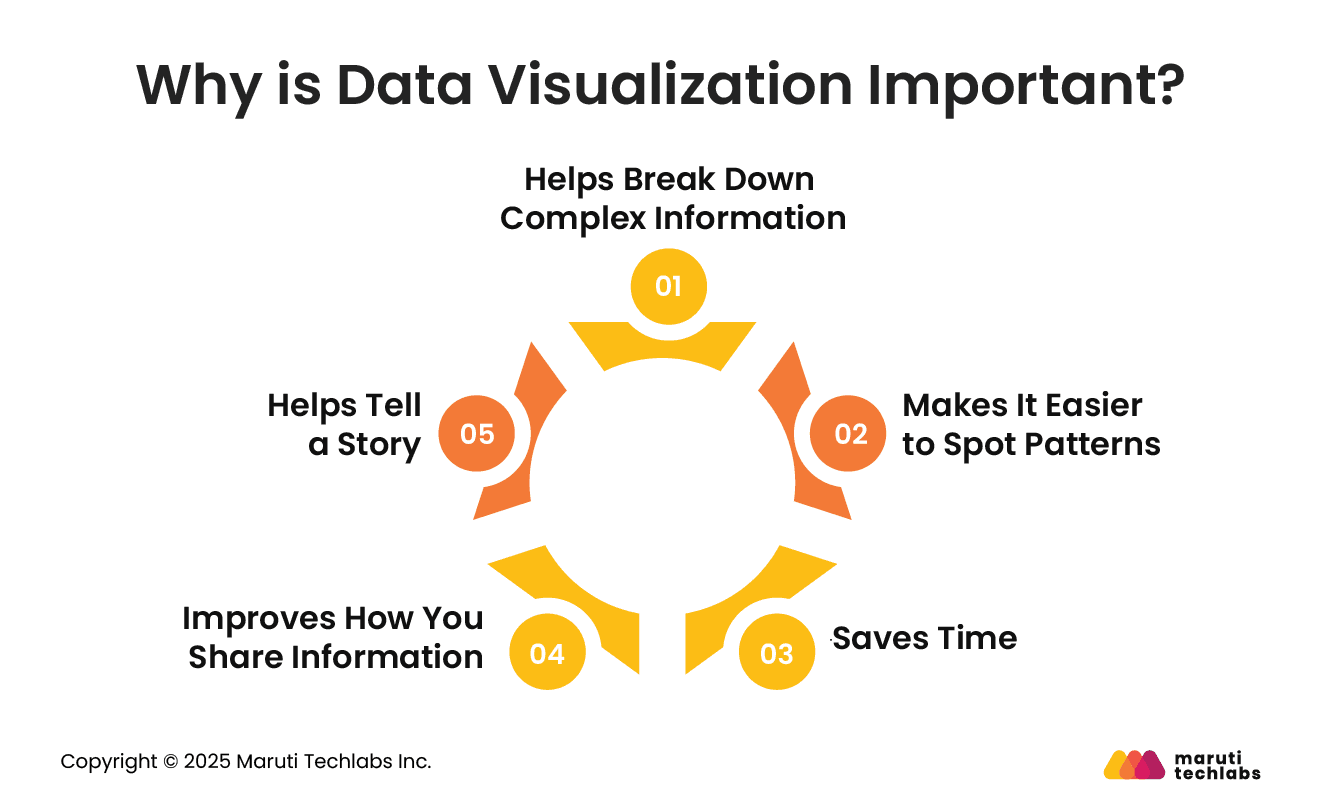
Why is Data Visualization Important?
Data visualization helps people make sense of large and complex information. Instead of looking at rows of numbers or any numerical data, you can view a chart or graph and quickly understand. Here are five simple reasons why visualization is helpful.
1. Helps Break Down Complex Information
When data is too big or complicated, it’s hard to understand just by reading it. Visualization turns this information into visuals that are easier to read. For example, a heat map showing state-wise sales performance can use red to mark states with losses. At a glance, you know which areas are doing poorly without having to read every number.
2. Makes It Easier to Spot Patterns
Sometimes, trends or relationships between numbers are hidden in plain text. A chart can make them stand out. For example, a graph that compares sales to profit may show that higher sales do not always mean higher profits. This kind of insight helps businesses make better decisions.
3. Saves Time
Looking at visuals is faster than reading tables. Imagine having profit data from 2013 to 2023. A simple line chart will instantly show that the company was doing well, except for a dip in 2018. That same insight would take much longer to find in a regular table.
4. Improves How You Share Information
Sharing data through charts or infographics is more effective, making it clear and easy for everyone. For example, a treemap showing sales by region clearly highlights California as the top performer without needing a detailed explanation.
5. Helps Tell a Story
Data visualization also helps you tell a story. You can guide your audience from the current situation to what needs to be done. For instance, if profits for some products are falling, a chart can show this clearly and suggest ways to fix the issue. In short, visualizing data helps people understand information faster, communicate better, and take smarter actions.
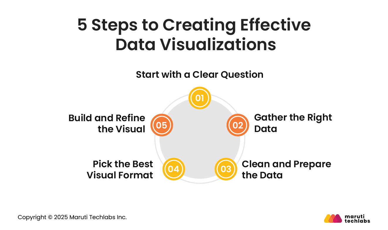
5 Steps to Creating Effective Data Visualizations
Creating a clear and useful data visualization takes more than choosing a chart type. It involves careful planning and execution. Here are five simple steps that help turn raw data into meaningful visuals:
1. Start with a Clear Question
Before jumping into charts, it’s important to know what you’re trying to find out. Ask yourself: What do I want to learn or show from this data? A clear question helps you choose the right data and way to show it. For example, if a retailer wants to know which type of product packaging leads to higher sales, that question will guide every step of the process.
2. Gather the Right Data
Once your goal is clear, collect the data that can help answer your question. This could include internal sources like past sales reports or external data like market trends. Like, in the packaging example mentioned above, you could collect sales data, customer feedback, and marketing results to help find higher sales.
3. Clean and Prepare the Data
Raw data often contains errors or unnecessary details. Cleaning the data means removing duplicates, fixing errors, and filtering it to keep only what’s needed. For instance, you might exclude holiday sales to find the average performance of each packaging type during regular times.
4. Pick the Best Visual Format
The type of chart or graph you use depends on what you want to show. A bar graph might be great for comparing sales across different packages, while a pie chart could show what percentage each packaging type holds in inventory. Interactive dashboards let users dig deeper, while static visuals tell a quick story.
5. Build and Refine the Visual
Finally, use a data visualization tool to create your visual. Make sure it’s easy to read and highlights key points. Use color, size, and labels wisely. Add a clear title, make sure numbers are accurate, and always provide context so the audience understands what they’re seeing.
These five steps make the data visualization process more focused, efficient, and useful for decision-making.
Different Applications of Data Visualization
Data visualization is useful across many industries. It helps people understand large amounts of information quickly and make better decisions. Here are a few ways different sectors use it:
Finance In finance, data visualization makes it easier to track income, expenses, cash flow, and investment performance at a glance. For example, a finance team can create a line chart to see how profits change over the year or use a dashboard to compare different product lines. This makes it easier to plan budgets and spot areas for improvement.
E-commerce Online businesses use data visuals to understand customer behaviour on their websites. They can track what people are buying, how they move through the site, and which campaigns are working best. For instance, an e-commerce company might use graphs to see which customer group buys the most and then target them with better deals or ads.
Healthcare Hospitals and healthcare providers use data visuals to track patient health, spot disease patterns, and plan resources. A chart can show how a patient’s vital signs change over time or where a virus is spreading the fastest. This helps doctors take quick action and manage resources better.
Real Estate In real estate, data visualization helps agents and investors understand market trends and property values. They can use maps or charts to compare prices in different areas or track how a neighborhood is growing. This helps buyers and investors make smart decisions.
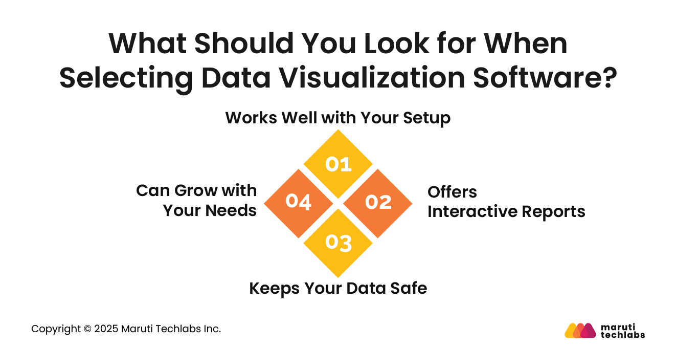
What Should You Look for When Selecting Data Visualization Software?
With so many data visualization tools available, both free and paid, it’s important to choose one that fits your business needs. Here are a few key things to keep in mind:
1. Works Well with Your Setup
The software should easily connect with your current systems, databases, and tools. It should also allow you to bring in data from outside sources, so everything you need is in one place.
2. Offers Interactive Reports
The best tools make it easy for anyone, not just data experts, to explore the data. Interactive reports let users filter, sort, or adjust the data directly in the chart. This means teams don’t always have to rely on developers to make small changes or dig deeper into the numbers.
3. Keeps Your Data Safe
Security is a must, especially when dealing with sensitive information. Good data visualization software should let you control who can view or edit your dashboards. This helps protect your business data from unauthorized access.
4. Can Grow with Your Needs
Your tool should be able to handle large amounts of data as your business grows. Look for platforms that support advanced features like machine learning or AI to help you work faster and more efficiently as your data grows.
Choosing the right data visualization tool helps you save time, share insights faster, and make better decisions, without adding extra hassle for your team.
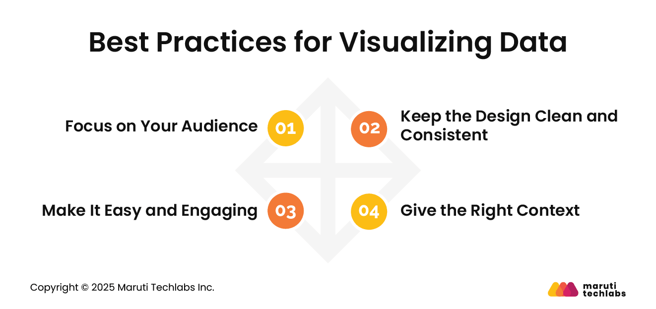
Best Practices for Visualizing Data
A good data visualization helps people quickly understand what the data is saying. To make sure your visuals are clear and useful, here are some simple best practices to follow:
1. Focus on Your Audience
Always think about who will be looking at your data. If your audience is new to data, avoid complicated visuals. Keep things simple and easy to understand. If they’re more experienced, you can include more detailed charts. The key is to match your visuals to what your audience knows.
2. Keep the Design Clean and Consistent
Use the right type of chart for the message you want to share. Avoid adding too many colors, shapes, or fonts. Stick to a consistent style across all visuals. This makes your charts easier to read and gives a more professional feel.
3. Give the Right Context
Your visuals should tell a clear story. Use titles, labels, and notes to explain what the data means. Always show where your data comes from. People can trust and interpret the information better when they understand the context.
4. Make It Easy and Engaging
If your visual is interactive, make sure it helps people explore the data without confusing them. Also, check that your visuals work well on different devices and are easy to read for everyone, including people with disabilities. Good design should be useful and inclusive.
Following these steps will help you create visuals that are not only accurate but also clear and impactful.
Conclusion
To sum it up, data visualization helps turn complex data into clear, meaningful visuals. It makes patterns easier to spot, saves time, and allows everyone, from business leaders to team members, to understand and act on insights faster. Whether in finance, healthcare, e-commerce, or real estate, using visuals to tell the story behind the numbers is a game-changer.
The key is to ask the right question, choose the right chart, and highlight what matters most. When done right, data visualization works with how our brains naturally look for patterns, using color, size, and layout to guide attention.
If you're looking to make the most of your data, Maruti Techlabs can help. Our data visualization services are designed to help businesses unlock insights, make informed decisions, and present data in a way that makes sense. Contact us to start your journey toward clearer and more effective data storytelling.
FAQs
1. What is data visualization?
Data visualization is turning raw numbers or information into visual formats like charts, graphs, or maps. It helps people quickly understand patterns, trends, and insights hidden in data. Instead of reading long tables or rows of numbers, you can look at a picture and understand what the data is saying.
2. What are data visualization tools?
Data visualization tools are software programs that help you turn data into charts, graphs, dashboards, or maps. They make it easier to explore, understand, and share data. Some popular tools include Tableau, Power BI, Google Data Studio, and Looker. These tools allow users to interact with visuals, filter data, and find key insights without writing code.
3. Why is data visualization important?
Data visualization is important because it makes complex data easier to understand. It helps people spot patterns, compare values, and make better decisions. Whether you are tracking business performance, analyzing customer behavior, or exploring health trends, visualizing data saves time and makes communication clearer for everyone.
4. What is the primary purpose of data visualization?
The main purpose of data visualization is to help people understand data quickly and easily. It turns numbers into pictures so you can find patterns, see trends, and make informed choices. Instead of reading long reports, visuals give you a simple way to grasp what the data means at a glance.
About the author
Pinakin Ariwala
Pinakin is the VP of Data Science and Technology at Maruti Techlabs. With about two decades of experience leading diverse teams and projects, his technological competence is unmatched.
Stuck with a Tech Hurdle?
We fix, build, and optimize. The first consultation is on us!