

7 reasons why Conversational Interfaces will replace Web Forms


There has been a fair amount of hype surrounding conversational interfaces or conversational UI lately and for good reason. Interfaces that allow users to interact with the machines using natural language processing either by talking or writing – akin to human-to-human conversations. With every passing day, we get closer to bridging the gap of natural communication between man and machine.
These days, the process of filling out a form or sharing your information on most websites has become less tedious and more informal due to the wide adaptation of conversational UI. However, prior to the steady adaptation of conversational UI, one had to trudge through a barrage of web forms in order to access content or seek out information.
Even as of today, how many web forms are filled out every day across the Internet? Thousands and thousands of them, right? From government portals to the most obscure blogs, it is hard to imagine a website not having at least one form – just one of those necessary evils. Web forms are pretty much the evolution of their paper counterparts. A collection of labels, boxes, and circles designed to receive a limited level of input and make it easier for data to be processed. The web forms come with their own set of constraints on the interface level, in order to ensure uniformity of data being collected and subsequently processed. Looking back, web-based forms were nowhere close to the ones we have today.
Forms before the Internet
Seems nightmarish, doesn’t it? Your typical form with multiple questions and square blocks for answers resulting in half-hearted responses from our side and a tendency to leave out details just to be done with the task. On top of that, the whole idea of having to wait in an endless admin-desk queue and progressing at a snail’s pace sounds repugnant, to say the least. This is often the reason why most folks don’t relish filling out any sort of forms.

The early days of the World Wide Web: 1991 – 1998
The foremost years of the Internet (1991-1996) stay obscure as far as traditional web forms are involved. Truth be told, at this point, we no longer have the means to access and examine how they looked back then. As we all know, in an exceedingly short time, the World Wide Web (WWW) became a highly accepted as well as populated medium and pretty soon, almost every website had custom web forms, albeit, extremely elementary.
Interestingly, prior to the adoption of web-based forms, client feedbacks were processed through executable files running on the hard disc. It truly was a tedious task to search out something like a web contact form (back then, they ran on an interface that was uninteresting and dull, to say the least – HTML based with none or minimal CSS) wherein for subscribing to a service, you possibly had to download a form, fill in a hard copy and then send it to the webmasters via postal services. The web forms at that point principally performed only search and submission tasks.
Web forms and online sales: 1994 – present
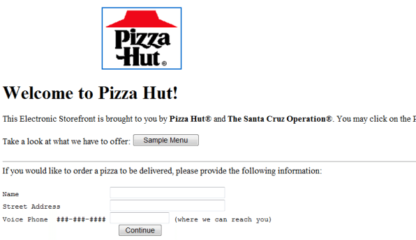
Enter 1994, and you have two predominant additions to the Internet landscape: electronic banking and online ordering (noteworthy mention – Pizza Hut’s online sale). Pretty soon in the following year, Amazon went ahead and ventured into the online shopping arena with eBay following suit. Naturally, all of them were using web forms, however, those days, e-commerce was hindered by the constraints of credit cards that did not support any of the online transactions. By 2000, that no longer remained an obstacle with online payment processors making their presence known in the market.
Web forms could then exhibit merchandise and direct submissions were made right to the payment gateway where they could complete the transactions. This truly was a big feat for the Internet, as it was now on its way to being a part and parcel of the day-to-day life of regular individuals.
Web forms and Social Media: 2004 – present
The launch of Facebook (2004) and Twitter (2006) – two defining moments in the world of Social Media – also brought forward the subsequent evolution of web forms. Facebook had the foremost attention-grabbing evolution where it provided its own tools for making straightforward polls and designing events. In the initial stages, forms were quite elementary in their design and came with their own set of security-related flaws.
But that changed over time, especially, with the launch of free Developers API in 2006 which saw an upsurge of sorts in applications, widgets, and tools alike. Enter 2010, and you now had the form management apps where Facebook handed over the reins (so to speak) to the users who could now have their own sign-up forms for fan/community pages, reuse customized forms purchased separately and also assemble clear-cut mailing lists. Ever since then, forms and surveys through Facebook have been go-to tools for any business(es) looking to venture into social media marketing.

Security concerns
Even though Netscape came out with their SSL protocol for encryption in 1994, the advent and steady growth in the increase of web-based forms consistently raised the question of security. The respondent’s/subscriber’s trust and security were of paramount concern for any business that relied on online forms. How could you stop bots from signing up countless times? Even the best IP validation methods weren’t exactly impeccable. Tools to counter spam (CAPTCHA/Password protection) finally came to the forefront in the year 2000.
One of the most popular web-form based hijack took place in Nov 1999, where slashdot.org ran a web poll trying to identify the leading grad school in computing back then. Even though the IPs were stored in order to intercept duplicate entries, Carnegie Mellon’s students managed to execute a program that voted a couple thousand times for their university. This was followed by their competitors (MIT students) who went on to put up their own program and all valid submissions within the poll were overshadowed with two rival bots taking over. Fortunately, over time, security options we have gotten far more systematic and safe.
Web Forms as on today
The first What You See Is What You Get (WYSIWYG) form builders came out in 2007 where you could create forms from remotely hosted form generators that came with intuitive interfaces. HTML know-how wasn’t mandatory anymore which meant that anyone with minimal technical knowledge could construct their own customized web form.
The portrait of a form that stands at the highest of the evolution chain includes, by case:
Conversational Interface
Steadily, over the last couple months, conversational interfaces have been touted as the next big thing and a massive leap in terms of customer/subscriber interaction. Web forms are soon to be a thing of the past as we fully enter in the era of natural language processing.
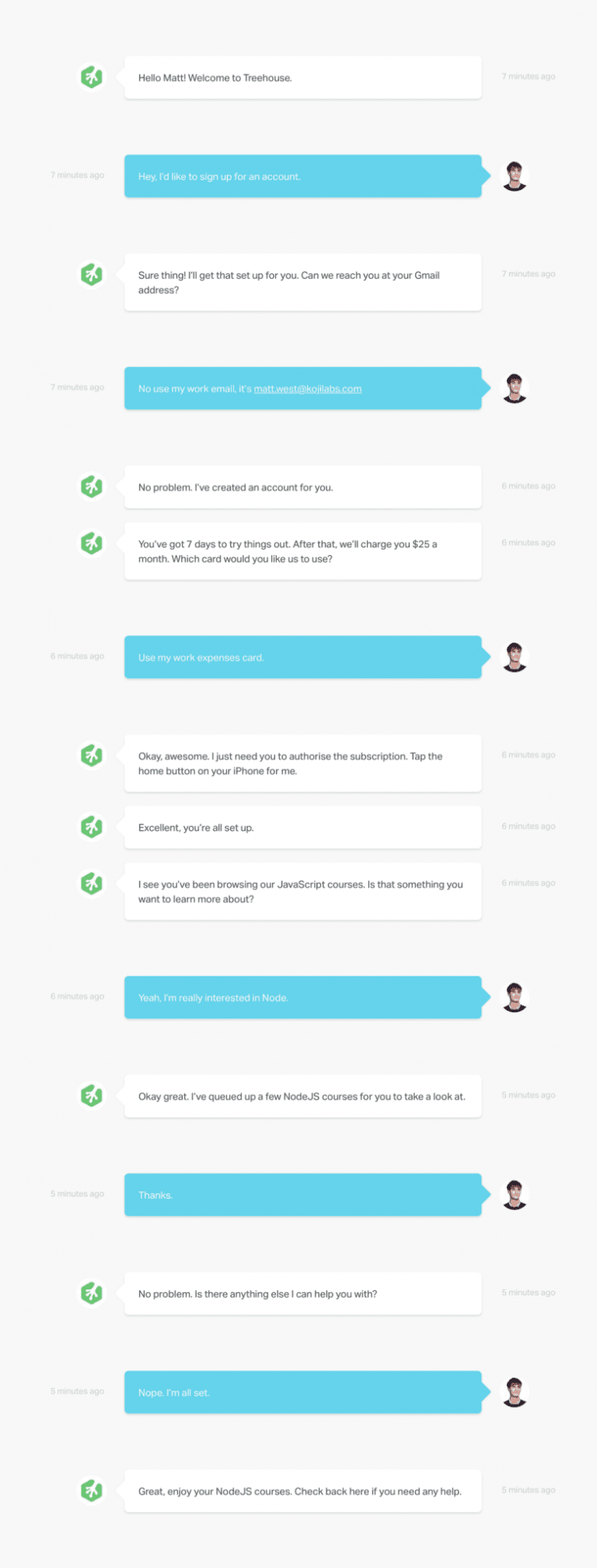
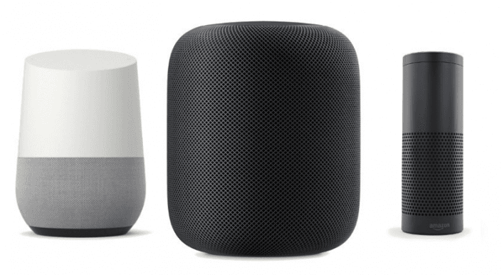
To cover the basics, conversational forms/interfaces come in two formats – voice assistants or voice user interfaces (Apple – Siri, Amazon – Alexa and Samsung – Bixby) and chatbots (Slackbot, Facebook M, Magic and kik). How do they work? They allow commanding the computer or a device with a conversation (written or oral) and carry that interaction forward in a manner similar to humans thereby relieving the end user from the tedious process of filling out a form and providing a more “human” experience through pre-defined templates. According to Gartner, by 2018, 30 percent people will make interaction and conversations through voice-based systems.
Advantages of Conversational Interface
Elucidated below are some of the reasons as to why Conversational UI is all set to replace the web forms –
Conversation using words is a natural form of communication for people, VUI makes it more exciting. The ability to associate a voice with the technology being used is what makes the experience more personalized/human and less mundane especially when human brains are basically wired to interpret the supply of speech as human. It is an evident example of how AI solutions such as interactive voice systems are a more natural means of interaction than visual interfaces for most users. Users are placed in a far more acquainted context by removing a visible interface and exchanging it with voice.
While VUIs might sound sort of a new thought, they have been around long before the primary interface. One of the primary VUIs, known as Shoebox, was created in the early sixties by IBM. It had been a forerunner of today’s voice recognition systems. Further development of VUI systems was restricted due to limitations in computing power. It takes some serious computing power in order to interpret human speech in real-time (it took 50 years in order to develop systems capable of achieving the same).
With further advances in Machine Learning and Artificial Intelligence, it is safe to say that we are gradually and consistently moving towards “conversation being the confluence of interaction” with technology. Having said that, with nearly 1/3 of the global population owning devices and smartphones that support voice interaction, it is not too farfetched to predict that the majority of the users are more than prepared to adopt voice interfaces as a part of their daily lives.
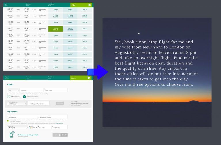
The need to sign up, make new accounts or download new apps in order to get something or use a service isn’t exactly something that is preferred by the end user. This is where systems with conversational UI come into the picture by streamlining the process and getting various apps and/or accounts to work together in sync through a conversation. You don’t need to fret about having to download 2 separate applications if you’d like to reserve a flight ticket and book a cab to the airport. You could just connect these services to a chat interface, speak/write to them and voila! Start packing for your trip.
If you own a smart home, you have your thermostats, lights, kettles and other devices connected online. However, the current challenge with Internet of Things (IoT) devices is that not all of them suit a graphical user interface (GUI) so naturally. Utilizing a VUI can help in integrating such devices organically within our environments.
So far, end users have always used interfaces that compel the users to study and learn the interface first and then summon the same during their next interaction with the interface. Compared to this, a conversational interface is far more convenient as interacting with it requires nothing more than writing or directly speaking to it. Having an interface that doesn’t require their end users to spend valuable time in learning it or there is no learning curve involved in order to achieve expected results creates an effortless and frictionless experience.
With customizations available for the end users in the form of gender, tone, accent and pace of speech – a conversational interface or a device utilizing conversational UI can produce a deeper personal connection between a user and a system. This way, it is not just a device for the user, but more of a friend.
With current and future adoption rates of VUI, the key task for all UX designers will be to craft and design experiences for voice/text as well without applying the same old principles and guidelines. Curating a voice/text-based system design is poles apart as compared to crafting experiences for typical physical input and graphical output. This need is bound to inspire designers to focus more on the salient aspects such as
7.1 Anticipatory design
Although it is nearly impossible to develop a VUI that could predict every user command, it is still possible to design and curate a user flow that is contextually driven. If the conversational flow is right, you’ve got your recipe for success right there. With your objective to reduce your end user’s efforts in order to communicate with the VUI, it is imperative that designers understand the initial intent and anticipate needs at various “checkpoints” within the conversation in order to dish out relevant response(s).
7.2 Voice/text suggestions driven by context
It isn’t exactly possible for the end user to understand or know the limitless possibilities of a VUI mainly because of a lack of a visual GUI that they have been used to for all this time. This is where UX designers need to utilize context-specific voice/text suggestions that help the end user understand what it is that the voice interaction system can do for them. In other words – feature discoverability for the user.
7.3 Prioritized data
At a time and age where end users or consumers face lots of choices and tend to get stuck in decision paralysis or analysis paralysis, voice designers also need to take the principle of minimalism into account and inculcate the same within the VUI. This way, when brief and concise information is relayed to the end user, they are not overwhelmed or confuse their users with multiple prompts.
Replacing your run of the mill web form with an interactive conversational interface is the need of the hour, given the fact that they have the potential to change and continuously enhance lives every day. At the core, it is all about taking daily mundane, time-consuming and mentally straining tasks and bringing it down to an informal customer friendly chat. This is applicable to any business, product or service – just needs to be done right.
Instead of having your website visitor go through a long-winded form with hundreds of boxes and minuscule buttons, you start their journey with one question – “What would you like me to do for you?”.
Turn your web form into a natural conversation today.
At Maruti Techlabs, we assist you deploying custom chatbots, at scale, with an interactive conversational interface that addresses the needs of your customers and enhances their overall experience on your website while simultaneously helping you in capturing quality leads and driving revenue as well as growth.


